Slippage Distribution (Entry & Exit)
What it is
Slippage is the difference between the price your strategy intended and the price your broker actually filled. The Slippage Distribution view shows this difference across all your live trades as a histogram with a kernel density estimate (KDE) overlay, separately for entries and exits. This gives you a clear statistical picture of your execution quality — not just the average slippage, but the full shape of the distribution.
Understanding the shape matters. An average slippage of −0.2 price units (the scale depends on your instrument — for BTCUSD, 1 price unit = $1; for forex pairs, price units are in the instrument's native decimal scale) could mean every trade slips by −0.2 price units (consistent, predictable), or it could mean half your trades slip by +1 price unit and half slip by −1.4 price units (variable, risky). The histogram reveals which.
How to access it
Navigate to Slippage Distribution in the Execution Quality dashboard. Available on Pro and Premium plans. Requires live trade data from an MT5-deployed strategy.
What you see
Slippage is measured in price units — the raw price difference in your instrument's native scale. For BTCUSD, 1 price unit = $1. For forex pairs, price units correspond to the instrument's decimal price scale. This makes slippage values directly comparable across instruments without conversion.
Two histogram plots — one for entry slippage, one for exit slippage:
- X-axis — Slippage in price units, calculated as
actual fill price − expected backtest price. For BUY orders: positive values mean you paid more than expected (adverse); negative values mean you paid less (favorable). For SELL orders: negative values mean you received less than expected (adverse); positive values mean you received more (favorable). - Y-axis — Frequency (number of trades).
- Bars — Histogram bins showing how many trades fell into each slippage range. Bin widths are calculated using the Freedman-Diaconis rule, which automatically adapts to your data for optimal resolution.
- KDE curve — A smooth kernel density estimate overlaid on the histogram, showing the continuous probability distribution of slippage.
- Summary statistics — Mean, median, standard deviation, and percentile values displayed alongside the chart.
How to interpret it
Distribution shape
Tight, symmetric distribution centered at zero: Ideal execution. Most trades are filled at or very near the intended price, with slippage equally likely to be positive or negative. Your broker is providing fair fills.
Shifted distribution (mean away from zero): Systematic slippage in one direction. For BUY strategies, a consistently positive mean indicates you are paying more than the backtest price on entries — an adverse execution cost. For SELL strategies, a consistently negative mean indicates the same. The further the mean from zero, the larger the cumulative drag on performance across many trades.
Wide distribution (large standard deviation): Variable execution quality. Some trades fill well, others poorly. This unpredictability makes it harder to model execution costs in your backtesting.
Fat tails (outliers beyond ±2 standard deviations): Occasional extreme slippage events — usually during news releases, low liquidity periods, or market gaps. Check whether the outliers cluster at specific times using the Temporal Patterns view.
Bimodal distribution (two peaks): Two distinct execution regimes — possibly different market conditions (e.g., normal hours vs. overnight) or different order types. Investigate what's causing the two modes.
Entry vs. exit comparison
Comparing the two distributions reveals whether your broker executes entries and exits with the same quality:
- Similar distributions — Consistent execution regardless of trade direction. Expected from a fair broker.
- Worse entry slippage — More common than you'd expect. Entries often occur on momentum (you're buying as price rises), creating natural adverse slippage. Some of this is market microstructure, not broker behavior.
- Worse exit slippage — Less common. If exits consistently slip more than entries, investigate your exit timing — exits during volatile moments (stop-loss fills) naturally have more slippage than planned exits.
Example
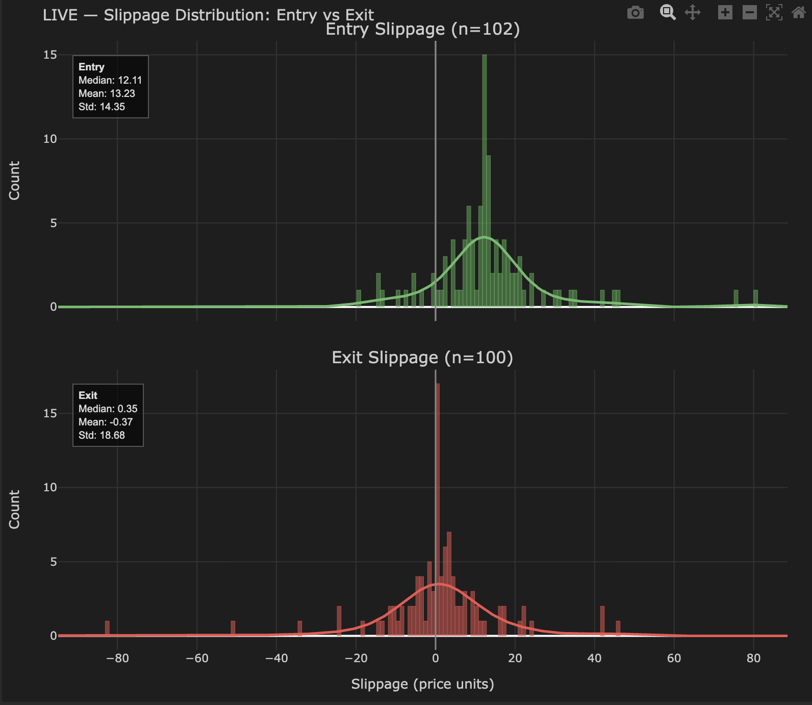
After 200 live trades on a DEMA/EMA crossover on BTCUSD:
Entry slippage distribution (BUY strategy):
- Mean: +13.2 price units
- Median: +12.1 price units
- Std dev: 14.4 price units
- Shape: Positive-shifted — most fills are above the backtest price, consistent with buying into momentum
Exit slippage distribution:
- Mean: −0.37 price units
- Median: +0.35 price units
- Std dev: 18.7 price units
- Shape: Centered near zero with a wide spread — exits are less directionally biased than entries
Interpretation: Entry slippage has a positive mean (+13.2 price units), meaning trades are filled above the backtest price on average — the typical adverse fill for a BUY strategy entering on momentum signals. Exit slippage is centered near zero, indicating exits execute without systematic bias. The wide standard deviation on exits reflects variable conditions at close time. Cross-reference with the Temporal Patterns view to identify whether specific hours drive the worst entry slippage.