Slippage vs P&L
What it is
This view examines whether there's a relationship between the slippage on a trade and the trade's profit or loss. In a fair execution environment, slippage should be independent of trade outcome — your broker shouldn't be filling winning trades differently from losing trades, because neither party knows the outcome at the time of execution. If slippage does correlate with P&L, it raises questions about execution fairness that warrant investigation.
How to access it
Navigate to Slippage vs P&L in the Execution Quality dashboard. Available on Pro and Premium plans.
What you see
A 2D contour density plot where:
- X-axis — |Total Slippage| (price units) — absolute combined entry+exit slippage per trade.
- Y-axis — Trade P&L ($) — profit or loss in account currency.
- Green dots — winning trades, red dots — losing trades, plotted individually over the density.
- Stats box — shows correlation coefficient r with plain-English label (None / Weak / Moderate / Strong), total trade count, win rate, and slippage type (entry+exit combined).
The density approach reveals the aggregate pattern across many trades, while the individual colored dots let you visually confirm whether winners and losers separate along the slippage axis.
How to interpret it
Independence (no relationship) — expected result
The density cluster shows no systematic tilt or relationship between slippage and P&L. Trades with high slippage are equally likely to be winners or losers. The cluster is roughly circular or horizontal. When r is labelled None (typically |r| < 0.1), slippage is independent of trade outcome.
What it means: Your broker provides execution that is independent of trade direction and outcome. Slippage is a cost, but it's applied fairly. This is the expected result for reputable brokers.
Negative correlation (worse slippage on winning trades)
Trades with higher P&L tend to have worse slippage. The density tilts so that the most profitable trades cluster with the most negative slippage.
Possible explanations:
- Market impact — Your largest wins come from fast-moving markets where slippage is naturally higher. This isn't broker behavior; it's market microstructure. Check whether trade size or volatility at entry explains the pattern.
- Momentum entries — Winning crossover trades often trigger during strong momentum, meaning you're buying into a rising market. Natural adverse slippage on these entries is expected.
Positive correlation (better slippage on winning trades)
Winning trades have better fills. This is unusual and worth investigating:
- Could indicate that the signal itself is correlated with liquidity conditions — your strategy enters during liquid moments and exits during illiquid ones.
- Rarely indicates broker favoritism; more commonly a market microstructure artifact.
Asymmetric clusters
Distinct clusters for winning vs. losing trades with different slippage profiles. For example, winners clustered at low absolute slippage, losers clustered at higher absolute slippage. This pattern is worth monitoring and would justify comparing execution with a different broker.
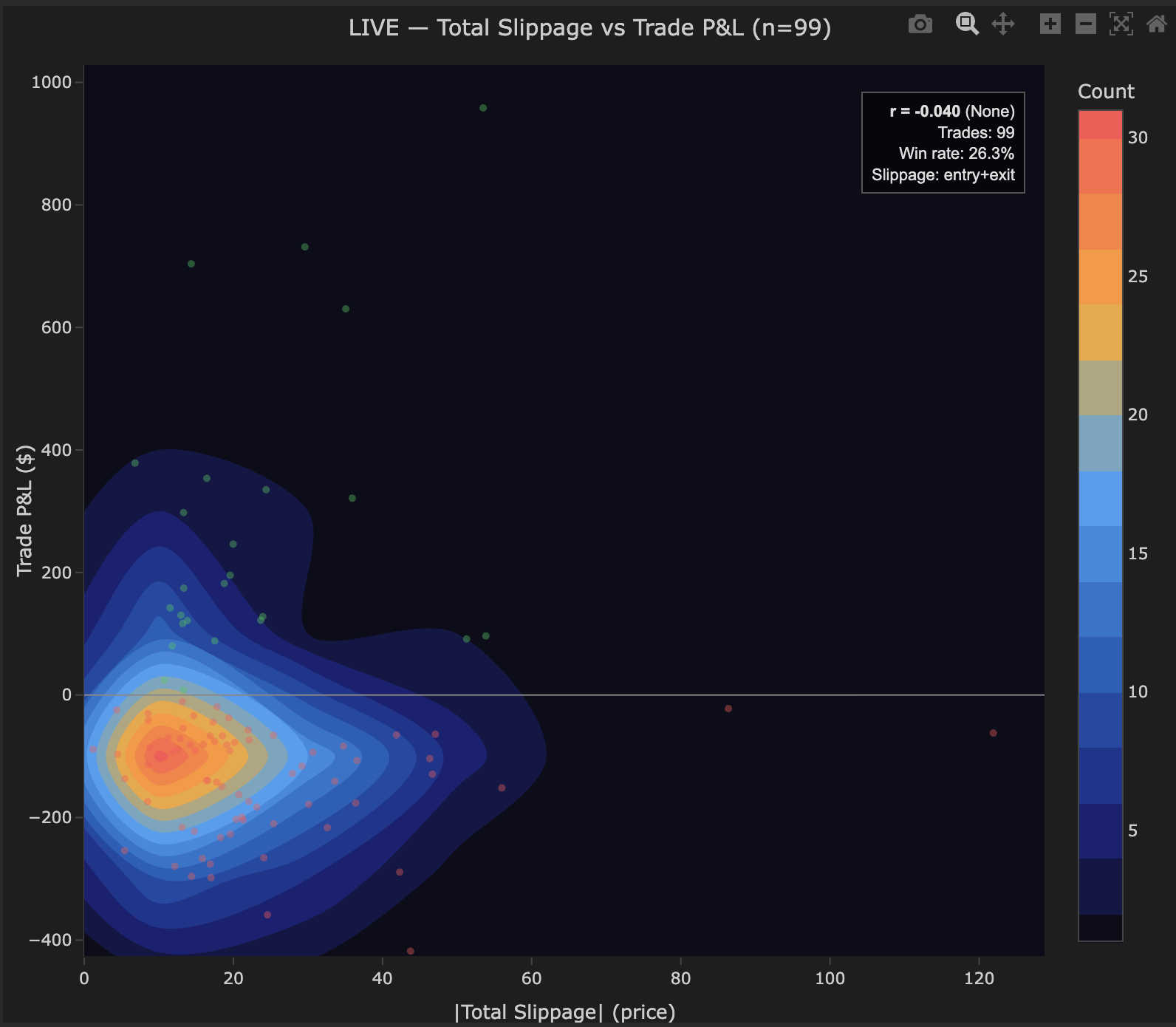
Example
Slippage vs P&L density for 99 trades on BTCUSD:
- r = −0.040 (None) — shown in stats box.
- Trades: 99, Win rate: 26.3%, Slippage: entry+exit combined.
- Main cluster: Concentrated at 0–40 price units total slippage, P&L ranging from −400.
- Green (winning) and red (losing) dots evenly distributed across the slippage range — no systematic separation.
- Outlier winning trades visible at P&L > $600 with low slippage — large winners execute cleanly.
Interpretation: r = −0.040 confirms no relationship between slippage and trade outcome. The broker fills winning and losing trades with identical quality. Execution costs are a consistent drag applied fairly across all trades.