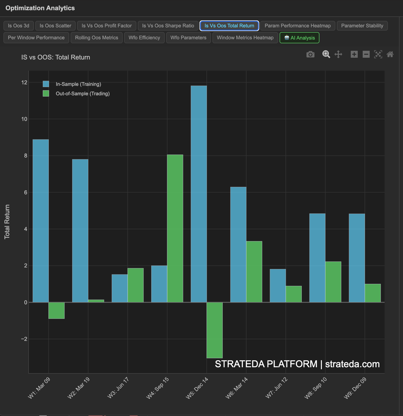
IS vs OOS Return Comparison
What it is
This chart places the in-sample return and out-of-sample return side by side for each walk-forward window. It provides the most direct visual answer to the central WFO question: "How much of the optimizer's performance survived contact with unseen data?"
Some degradation from IS to OOS is expected and healthy — the optimizer had the advantage of fitting to IS data. The question is whether OOS returns are still meaningfully positive.
How to access it
Navigate to the IS vs OOS Return tab in the WFO analytics popup. Available on Premium plans.
The WFO analytics popup is accessed via the table icon in the View Panel after your WFO job completes. See The Strategy Panel & View System for full details.
What you see
A bar chart with paired bars for each window:
- IS bars — The total return achieved during the in-sample optimization period.
- OOS bars — The total return achieved during the out-of-sample period using the parameters selected from IS.
- Windows are arranged chronologically on the x-axis.
The IS bars are typically taller — this is normal and expected.
How to interpret it
Expected degradation
IS-to-OOS degradation of 50–75% is common and acceptable. If your IS return was +8% and the OOS return is +2–4%, the edge survived at reduced magnitude.
Minimal degradation (OOS > 80% of IS): Unusually good. Either the strategy has a very strong structural edge, or the OOS window happened to be favorable. Verify across multiple windows before concluding the edge is this strong.
Moderate degradation (OOS is 30–60% of IS): Normal and expected. The optimizer found a real pattern, but part of the IS result was noise that didn't persist. Most genuinely robust strategies land in this range.
Severe degradation (OOS < 20% of IS, or negative): The optimizer was mostly fitting noise. If this happens consistently across windows, the strategy concept is likely not viable.
Patterns across windows
- Consistent ratio — IS and OOS bars maintain roughly the same proportion across all windows. This is ideal — the strategy behaves predictably.
- OOS bars growing over time — More recent market conditions favor the strategy. Positive sign, but verify it's not just one good recent window.
- OOS bars shrinking over time — The edge may be decaying as market conditions change.
- Mixed results — Some OOS windows positive, others negative. This is regime dependency — check whether losing windows correspond to identifiable market conditions.
A note on high IS performance
A strategy with IS Sharpe of 4.0 and OOS Sharpe of 1.2 has a Walk-Forward Factor of 0.30. That looks low — but an OOS Sharpe of 1.2 is genuinely strong. Don't dismiss a strategy just because the ratio is low; evaluate the absolute OOS performance.
Example
A 7-window WFO for a DEMA/EMA crossover on EURCHF:
| Window | IS Return | OOS Return | Degradation |
|---|---|---|---|
| 1 | +6.2% | +1.8% | 71% |
| 2 | +5.8% | +2.1% | 64% |
| 3 | +7.1% | −0.4% | >100% (negative OOS) |
| 4 | +4.9% | +0.6% | 88% |
| 5 | +6.5% | +1.5% | 77% |
| 6 | +5.3% | +2.3% | 57% |
| 7 | +6.0% | +1.1% | 82% |
IS returns are consistently strong (4.9–7.1%). OOS returns are mostly positive (6 of 7 windows), with degradation ranging from 57% to 88%. Window 3 is the single negative outlier. Overall, a solid profile — the edge degrades but persists.