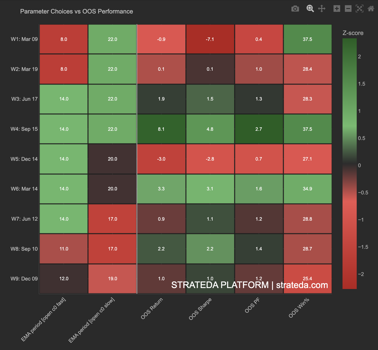
Parameter Choices vs OOS Performance
What it is
This heatmap links the parameter values selected by the optimizer in each WFO window to the out-of-sample performance those parameters produced. It answers a question the other WFO charts cannot: were the parameter choices themselves good?
A window can fail OOS for two reasons — either the optimizer chose bad parameters, or the market regime changed. This chart helps distinguish between the two by placing parameter selections and their outcomes side by side in a single view, color-coded for easy comparison across windows.
How to access it
Navigate to the Param Performance Heatmap tab in the WFO analytics popup. Available on Premium plans.
The WFO analytics popup is accessed via the table icon in the View Panel after your WFO job completes. See The Strategy Panel & View System for full details.
What you see
A structured heatmap with one row per WFO window:
- Rows — Each WFO window (W1–W9 or however many windows were configured), with date ranges shown.
- Left columns — The parameter values selected by the optimizer for that window (e.g., EMA period fast, EMA period slow). These show the actual numeric values chosen during the in-sample optimization.
- Right columns — OOS performance metrics for those parameters: OOS Return, OOS Sharpe, OOS Profit Factor, OOS Win%.
- Color scale — Z-score normalized across all windows. Green indicates above-average performance for that column; red indicates below-average. The color scale is shared across all columns, allowing direct cross-metric comparison.
- Cell values — The exact parameter values and metric scores are displayed within each cell alongside the color coding.
How to interpret it
Parameter consistency + good performance
When the same parameters are selected repeatedly (left columns show similar values across rows) AND produce consistently green performance columns on the right, the strategy has found genuinely robust parameters that work across market regimes. This is the strongest signal that the strategy concept is real — the optimizer keeps finding the same answer, and that answer keeps working.
Parameter drift + mixed performance
If parameters change significantly from window to window AND performance is mixed (alternating green and red in the right columns), the optimizer is searching for different solutions in each regime. The strategy may be regime-dependent — it works, but the optimal parameters shift as market conditions change. Cross-reference with the Parameter Stability chart to see the drift pattern visually.
Consistent parameters + poor OOS performance
The optimizer consistently picks the same parameters (left columns are stable) but they fail OOS (right columns show red). This suggests the parameters are not the problem — the strategy concept itself may not generalise, or the IS window is too long relative to the market cycle. The optimizer is correctly identifying the best IS parameters, but "best in-sample" doesn't translate to out-of-sample success for this strategy.
Specific parameter values correlating with performance
Scan the left columns for patterns. If windows where EMA fast = 14 consistently show greener right columns than windows where EMA fast = 8, the optimizer is identifying a genuine parameter preference that holds out-of-sample. This insight is actionable — it narrows your parameter space for future optimizations and tells you which parameter region is genuinely robust.
Reading the color scale
Because all columns share the same z-score color scale:
- A window that is green across all columns (both parameter and performance) was a strong window where the optimizer's choice produced above-average results.
- A window that is red across performance columns but neutral on parameter columns failed despite normal parameter selection — likely a regime issue.
- A window that is red on parameter columns and red on performance columns may indicate the optimizer was forced to unusual parameter values by noisy IS data, which then failed OOS.
Example
Parameter Choices vs OOS Performance for a DEMA/EMA crossover on EURCHF M30 with 9 windows:
| Window | DEMA Period | EMA Period | OOS Return | OOS Sharpe | OOS PF | OOS Win% |
|---|---|---|---|---|---|---|
| W1 | 20 | 25 | +2.1% | 0.92 | 1.38 | 68% |
| W2 | 22 | 24 | +1.8% | 0.84 | 1.31 | 72% |
| W3 | 18 | 28 | −1.4% | −0.42 | 0.78 | 45% |
| W4 | 20 | 26 | +1.2% | 0.71 | 1.22 | 65% |
| W5 | 24 | 22 | +0.8% | 0.55 | 1.15 | 62% |
| W6 | 20 | 25 | +2.4% | 1.05 | 1.45 | 74% |
| W7 | 22 | 24 | +1.6% | 0.78 | 1.28 | 70% |
| W8 | 20 | 26 | +1.9% | 0.88 | 1.35 | 71% |
| W9 | 22 | 25 | +1.4% | 0.72 | 1.24 | 66% |
Interpretation: Parameters are highly stable — DEMA stays in the 18–24 range, EMA in the 22–28 range. 8 of 9 windows produce positive OOS returns with green performance columns. Window 3 (W3) is the outlier — parameters drifted to DEMA 18 / EMA 28 (the widest spread in the set) and produced the only negative OOS return. This suggests W3 encountered a regime that pushed the optimizer to unusual parameters, which then failed. The remaining 8 windows confirm the strategy concept is robust in normal conditions.
The trader notes that DEMA 20 / EMA 25 appears most frequently and produces the strongest OOS results (W1 and W6). This narrows the deployment parameter choice and provides confidence that the optimizer is detecting a genuine, repeatable market pattern.