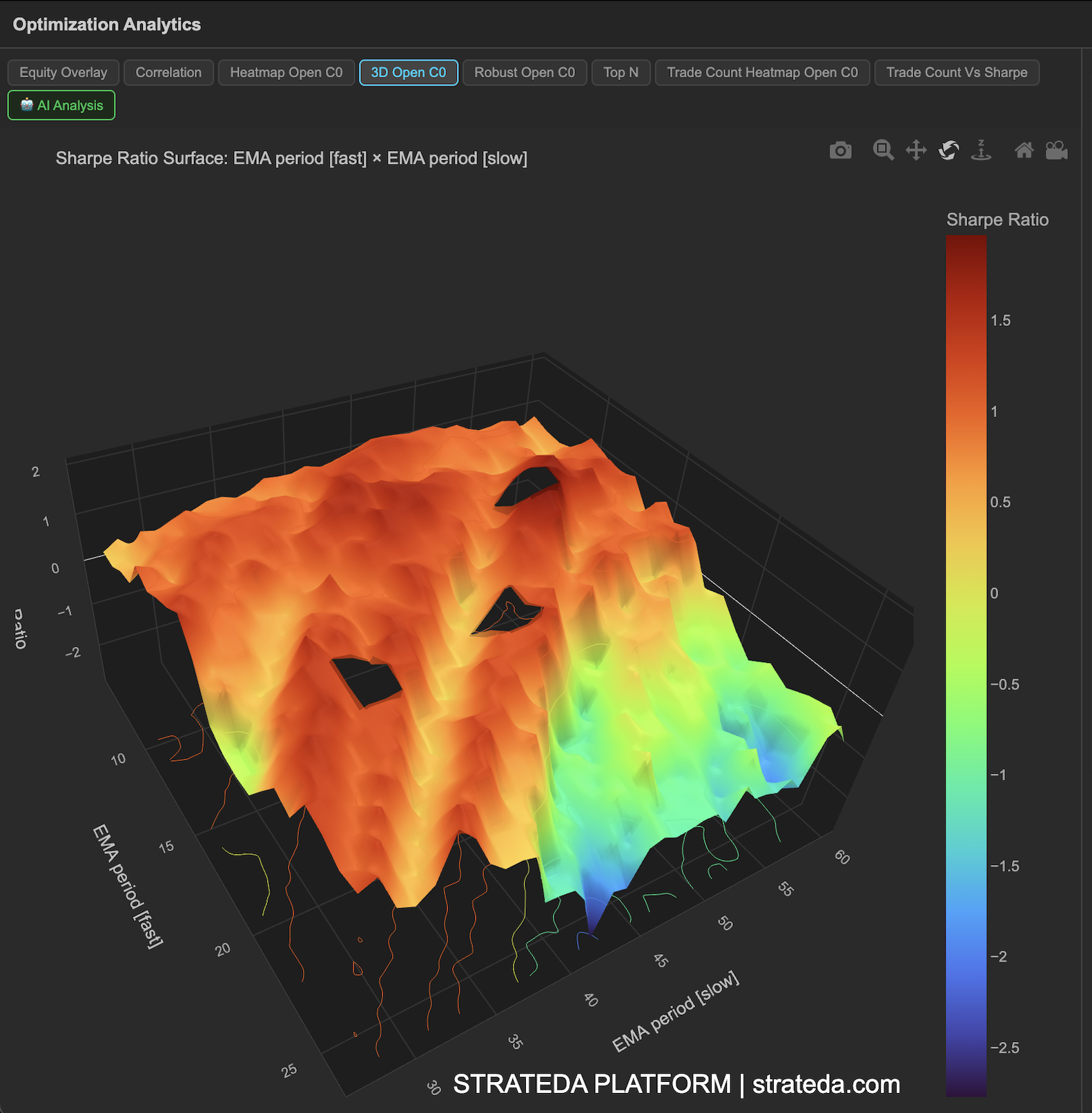
3D Performance Surface
What it is
The 3D Performance Surface takes the same data as the 2D heatmap and renders it as an interactive three-dimensional surface plot. The two parameter axes form the base plane, while the height (z-axis) represents the performance metric — typically Sharpe ratio. Peaks correspond to high-performing combinations; valleys correspond to poor ones.
This view is particularly useful for understanding the shape of the performance landscape. A broad plateau suggests robust parameters. A sharp spike suggests fragile, overfitted results. The 3D perspective makes these shapes easier to read than flat color grids, especially when performance gradients are subtle.
How to access it
Navigate to the 3D Open C0 tab in the optimization analytics popup. Available on Plus plans and above.
The optimization analytics popup is accessed via the table icon in the View Panel after your optimization job completes. See The Strategy Panel & View System for full details.
What you see
- X-axis — First optimized parameter values (e.g., EMA period).
- Y-axis — Second optimized parameter values (e.g., DEMA period).
- Z-axis (height) — Performance metric (Sharpe ratio by default).
- Surface coloring — The surface is color-coded by height, reinforcing the visual distinction between peaks and valleys.
- Interactivity — You can rotate, zoom, and pan the surface plot to examine it from different angles. Hover over any point to see the exact parameter values and metric score in a tooltip.
How to interpret it
Plateau (broad, flat elevated region): This is the ideal shape. A plateau means many neighboring parameter combinations produce similarly good results. The strategy is not sensitive to exact parameter values in this region. Choose parameters from the center of the plateau.
Sharp peak (narrow spike): A single combination dramatically outperforms its neighbors. This is a strong overfitting signal. The spike is likely fitting to noise in the historical data and is unlikely to generalize. Avoid selecting these parameters even if they show the highest absolute Sharpe.
Gradual slope: Performance improves steadily as you move in one direction along a parameter axis. This suggests a real relationship between the parameter and the strategy's edge. The optimal value may be at the edge of your tested range — consider extending the range.
Chaotic surface (many random peaks and valleys): No smooth structure in the performance landscape. This typically means the strategy doesn't have a stable relationship between parameters and outcomes. Results are dominated by noise.
Valley or basin: A region where performance drops significantly. Worth noting even if you wouldn't choose those parameters — it tells you which parameter regions to avoid definitively.
Example
A 3D surface for a DEMA × EMA crossover on BTCUSD shows:
- A clear plateau in the EMA 25–45 / DEMA 10–25 region, rising to Sharpe 1.4–1.8.
- The plateau drops off gradually toward longer periods (reduced signal frequency) and sharply toward shorter periods (noise-driven whipsaws).
- Rotating the surface confirms the plateau is genuinely broad — not a ridge that only looks wide from one angle.
The trader rotates the view to confirm the plateau extends in both parameter dimensions, then selects parameters from its center with confidence that small parameter variations won't dramatically alter performance.