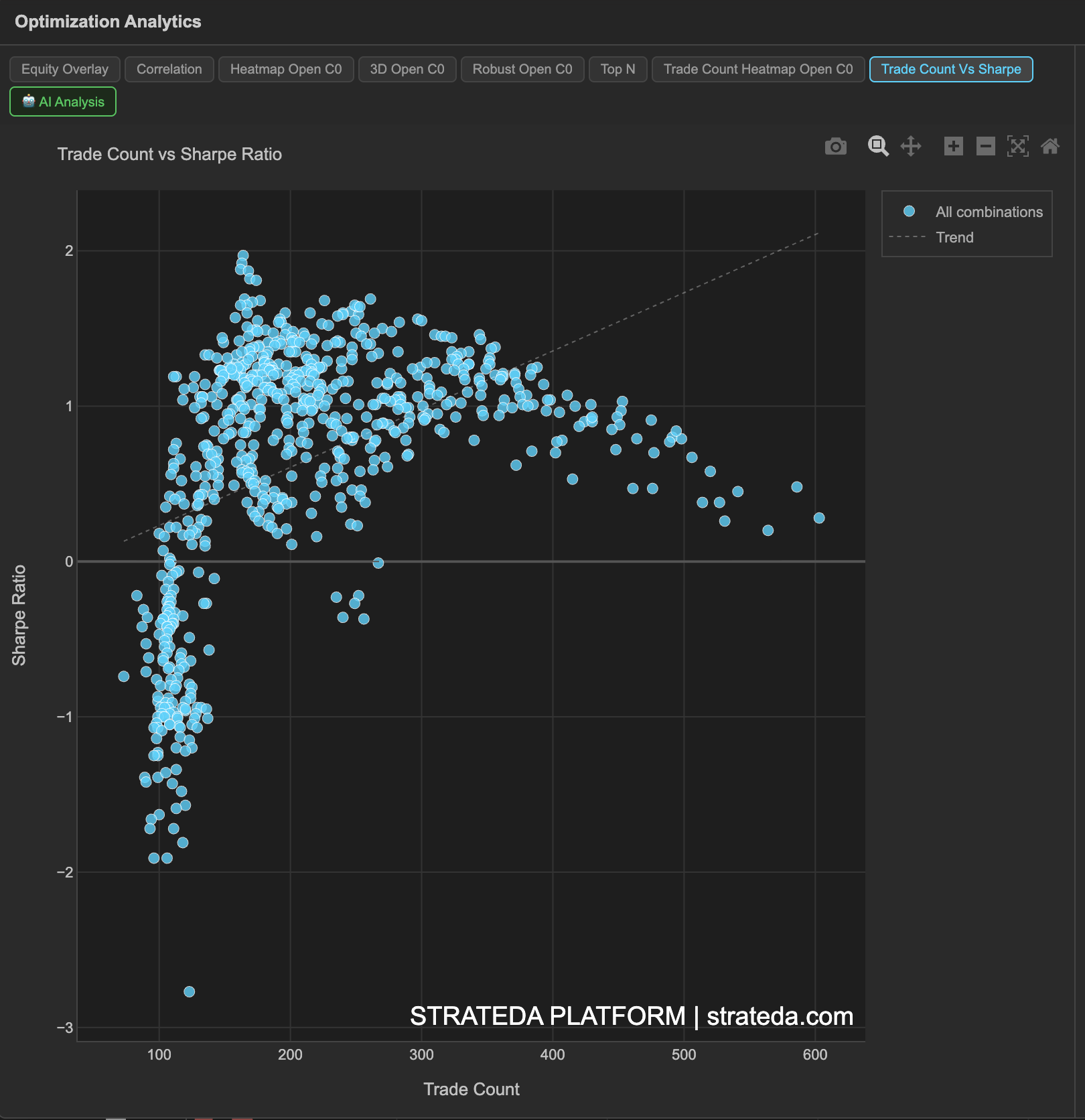
Trade Count vs Sharpe Ratio
What it is
This scatter plot shows every parameter combination from your optimization as a single point, positioned by its trade count (x-axis) and Sharpe ratio (y-axis). It answers the question that the Sharpe heatmap alone cannot: "Do my best Sharpe results come from combinations with enough trades to be statistically meaningful?"
A Sharpe ratio of 2.0 from 200 trades is a genuinely strong result. The same Sharpe from 12 trades is noise. This chart makes the distinction visual and immediate — and explicitly marks which combinations fall below the minimum trade threshold.
How to access it
Navigate to the Trade Count Vs Sharpe tab in the optimization analytics popup. Available on Plus plans and above.
The optimization analytics popup is accessed via the table icon in the View Panel after your optimization job completes. See The Strategy Panel & View System for full details.
What you see
- X-axis — Trade Count — the number of trades each parameter combination executed during the backtest period.
- Y-axis — Sharpe Ratio — the risk-adjusted return for each combination.
- Green dots — Valid combinations that meet or exceed the minimum trade count threshold (e.g., 150 trades or higher). These are statistically reliable and included in all analytics rankings.
- Red × markers — Excluded combinations that fall below the minimum trade count threshold. These are shown for reference but are excluded from rankings and heatmap analytics because their metrics are statistically unreliable.
- Dashed vertical orange line — The minimum trade count cutoff. Everything to the left of this line is excluded; everything to the right is valid.
- Dashed diagonal trend line — Shows the overall direction of the relationship between trade count and Sharpe across all valid combinations.
How to interpret it
The minimum trade threshold
The vertical orange line is your statistical reliability boundary. Combinations to the left have too few trades for their Sharpe ratio to be meaningful — they appear as red × markers to indicate they are excluded from the optimization analytics.
The threshold is set based on your data and parameter ranges. It ensures that only combinations with enough trades to produce statistically interpretable metrics are included in rankings, heatmaps, and the Top N view.
Correlation direction
The dashed trend line reveals whether trade count and Sharpe are related for your strategy:
Positive slope (upward trend): Higher-frequency combinations tend to have better Sharpe ratios. This is common when the strategy's edge benefits from more signals — more trades means more opportunities to capture the pattern. It also suggests the edge is consistent rather than dependent on a few large moves.
Negative slope (downward trend): Lower-frequency combinations tend to have better Sharpe ratios. This occurs when the strategy benefits from selectivity — fewer, higher-quality signals. Trading too frequently introduces noise and dilutes the edge.
Flat or no trend: Trade count and Sharpe are independent. The strategy's quality doesn't depend on how often it trades — performance is driven by parameter quality, not signal frequency.
Reading the scatter shape
Tight cluster of green dots (upper right): Many valid combinations with high trade counts and good Sharpe. The strategy works broadly across parameter space with sufficient statistical backing. This is the ideal outcome.
Green dots scattered widely: Valid combinations show a wide range of Sharpe values. Some parameters work, others don't — but all have enough trades. Use the heatmap to identify which parameter regions cluster the best Sharpe values.
High-Sharpe dots near the orange line: Combinations with impressive Sharpe ratios but trade counts just barely above the threshold. Treat these with more caution than combinations deep in the valid zone — they have the minimum statistical backing, not strong backing.
Red × markers with very high Sharpe: Excluded combinations showing Sharpe ratios above 2.0 or even 3.0. These are almost certainly noise — small trade counts produce extreme metrics in both directions. The exclusion is correct. Do not be tempted to override the threshold to include them.
Cross-referencing with other views
- Compare with the Trade Count Heatmap to see where in parameter space the low-trade-count combinations are.
- Compare with the Parameter Heatmaps to confirm that your best Sharpe region on the heatmap corresponds to green dots (not red ×) on this scatter.
- Check the Optimization Metrics Reference "Excl. (min trades)" count to see how many combinations were excluded.
Example
Trade Count vs Sharpe for a DEMA × EMA crossover optimization on BTC (400 combinations):
- Minimum trade threshold: 150 trades (vertical orange line).
- Valid combinations (green dots): 280 of 400 — concentrated at 150–280 trades with Sharpe ranging from −0.8 to +1.8.
- Excluded combinations (red ×): 120 of 400 — concentrated at 20–140 trades with Sharpe ranging wildly from −2.0 to +3.5.
- Trend line: Slight positive slope — higher trade counts correlate weakly with better Sharpe (+0.44 correlation from the Metric Correlation Matrix).
Interpretation: The excluded combinations (red ×) show far more extreme Sharpe values than the valid combinations — both extremely positive and extremely negative. This is the classic signature of small-sample noise: with few trades, metrics swing to extremes. The valid green dots show a much tighter, more realistic range of Sharpe values.
The trader's best valid combination (Sharpe 1.82, 195 trades) is comfortably above the threshold — not a borderline case. The three red × markers showing Sharpe above 2.5 are all below 60 trades and should be ignored despite their impressive headline numbers.