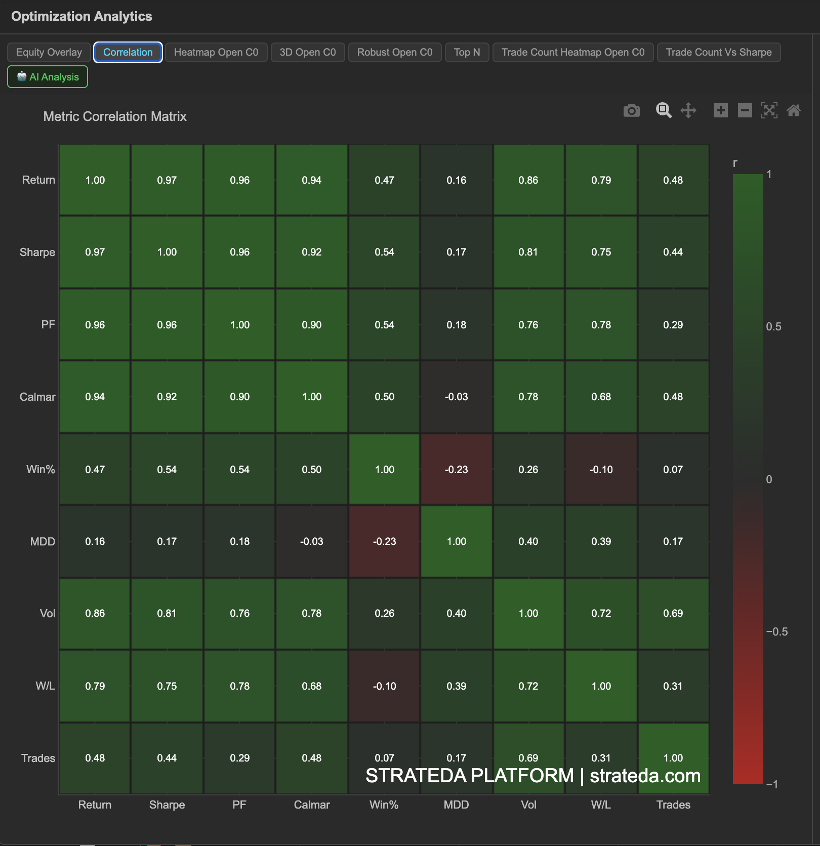
Metric Correlation Matrix
What it is
The Metric Correlation Matrix shows the pairwise correlation between all performance metrics computed during optimization. Across all parameter combinations, it measures whether metrics move together, move apart, or are independent. This helps you understand the relationships and trade-offs in your optimization results — for example, whether selecting for high Sharpe ratio also gives you a high win rate, or whether those metrics conflict.
How to access it
Navigate to the Correlation tab in the optimization analytics popup. Available on Plus plans and above.
The optimization analytics popup is accessed via the table icon in the View Panel after your optimization job completes. See The Strategy Panel & View System for full details.
What you see
A 9×9 heatmap showing correlation coefficients between the following metrics:
| Return | Sharpe | PF | Calmar | Win% | MDD | Vol | W/L | Trades | |
|---|---|---|---|---|---|---|---|---|---|
| Return | 1.0 | ||||||||
| Sharpe | 1.0 | ||||||||
| PF | 1.0 | ||||||||
| Calmar | 1.0 | ||||||||
| Win% | 1.0 | ||||||||
| MDD | 1.0 | ||||||||
| Vol | 1.0 | ||||||||
| W/L | 1.0 | ||||||||
| Trades | 1.0 |
- Cell color — Warm colors indicate strong positive correlation; cool colors indicate strong negative correlation; neutral colors indicate weak or no correlation.
- Cell value — The exact correlation coefficient (−1.0 to +1.0) is displayed in each cell.
- The matrix is symmetric (the correlation of A with B equals B with A), so you only need to read one triangle.
How to interpret it
Strong positive correlation (+0.7 to +1.0): These metrics tend to improve together. Optimizing for one effectively optimizes for the other. For example, Return and Profit Factor are often positively correlated — combinations that return more tend to have more favorable win/loss ratios.
Strong negative correlation (−0.7 to −1.0): These metrics move in opposite directions. Improving one typically comes at the cost of the other. For example, Max Drawdown and Calmar Ratio are often negatively correlated — deeper drawdowns reduce the Calmar score.
Weak or no correlation (−0.3 to +0.3): These metrics are largely independent. Knowing one tells you little about the other. For example, total number of Trades may have little correlation with Sharpe — some high-Sharpe combinations trade frequently, others trade rarely.
Key relationships to check:
- Sharpe vs. Return — If strongly correlated, picking by Sharpe also maximizes return. If weakly correlated, you face a trade-off between risk-adjusted and absolute performance.
- Win % vs. W/L Ratio — Often negatively correlated. High win-rate strategies tend to have smaller wins relative to losses (take quick profits, hold losses longer). This is normal.
- Trades vs. everything else — If trade count strongly correlates with performance, your strategy may benefit from (or suffer from) higher trading frequency. Check whether the best combinations have enough trades to be statistically meaningful.
Example
A correlation matrix from a DEMA × EMA optimization on BTC shows:
- Return and Sharpe — Correlation: +0.97. Very strongly aligned. Optimizing for Sharpe closely tracks total return.
- Win% and W/L Ratio — Correlation: −0.10. Essentially independent on this dataset. Win rate and average win/loss size are not meaningfully related here.
- Trades and Sharpe — Correlation: +0.44. Moderate positive. Higher-frequency combinations tend toward better Sharpe on this instrument.
- Win% and MDD — Correlation: −0.23. Moderate negative. Higher win-rate combinations tend to have slightly lower max drawdown.
The trader confirms that ranking by Sharpe is a sound choice for this strategy — it's very strongly aligned with total return (+0.97). The moderate positive correlation between Trades and Sharpe (+0.44) suggests that combinations with more trades tend to perform better, which is worth noting when evaluating low-trade-count combinations.