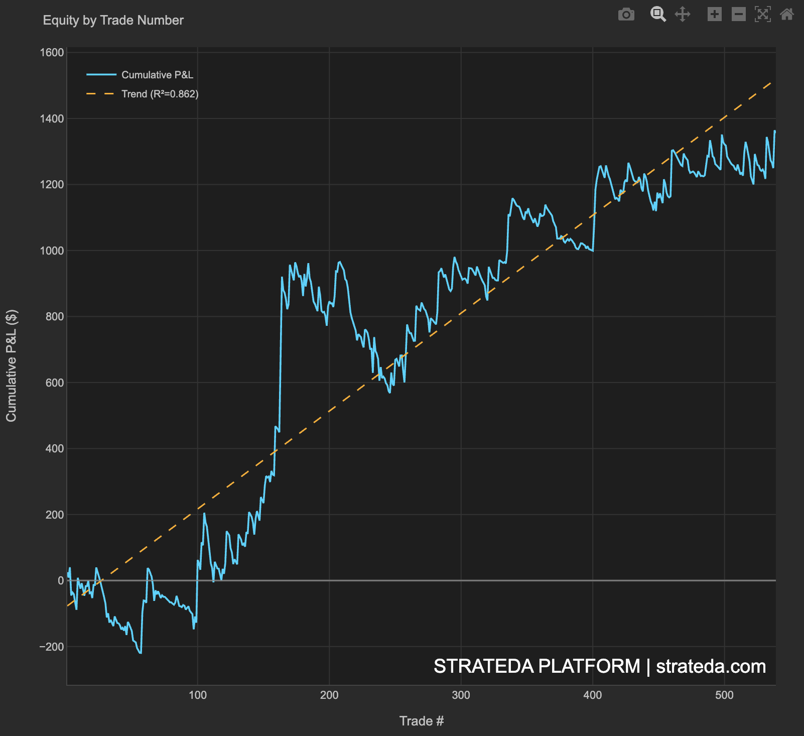
Cumulative P&L with Trend
What it is
The Cumulative P&L chart plots total accumulated returns over time — the equity curve — with a linear regression trend line overlaid. The trend line and its R² value measure how closely the equity curve follows a straight upward path. A perfect strategy would produce a straight diagonal line (R² = 1.0); real strategies deviate from this ideal, and the deviation tells you about consistency and risk.
This is the most intuitive performance view — the equity curve itself — enhanced with a statistical measure of quality.
How to access it
Navigate to the Equity by Trade tab in the performance dashboard. Available on Plus and above.
What you see
- X-axis — Trade number (sequential trade index, not calendar time).
- Y-axis — Cumulative P&L ($).
- Equity curve — The actual cumulative return at each point.
- Trend line — A linear regression fitted to the equity curve.
- R² value — Displayed on the chart. Measures the goodness of fit between the equity curve and the trend line.
How to interpret it
R² value
R² ranges from 0 to 1. It measures what percentage of the equity curve's movement is explained by a steady upward trend:
| R² | Interpretation |
|---|---|
| > 0.95 | Exceptional consistency. Equity curve is nearly a straight line. |
| 0.85–0.95 | Very good. Steady upward trend with minor deviations. |
| 0.70–0.85 | Good. Clear upward trend, but with noticeable drawdown periods. |
| 0.50–0.70 | Moderate. Upward trend exists but with significant volatility around it. |
| < 0.50 | Weak. The equity curve is dominated by noise rather than trend. |
Equity curve shape
Above the trend line in later trades: Performance is accelerating — the strategy is producing higher returns per trade than it did historically. This could indicate improving market conditions for the strategy, or compounding effects if position sizing is proportional to equity.
Below the trend line in later trades: Performance is decelerating. Recent trades are contributing less than the historical average. Monitor with rolling Sharpe to determine if this is a temporary dip or a structural decline.
Staircase pattern: Periods of flat equity (no gains) followed by jumps. Typical of strategies that wait for specific conditions and then capture large moves. R² will be lower, but the strategy may still be highly effective.
Smooth curve vs. jagged curve: Smoothness corresponds to consistency. A smooth curve with high R² is easier to trade psychologically and more predictable for position sizing. A jagged curve with the same total return is harder to manage and introduces uncertainty about future performance.
Trend line slope
The slope of the trend line represents the average return per trade (or per time unit). Steeper is obviously better, but evaluate it alongside R²:
- Steep slope, high R² — Strong, consistent returns. Ideal.
- Steep slope, low R² — High average returns but volatile. The equity curve deviates significantly from the trend, meaning actual experience will include painful drawdowns despite the good average.
- Gentle slope, high R² — Modest but reliable returns. Good for compounding with larger position sizes.
Example
Cumulative P&L for 200 trades on a DEMA/EMA crossover on EURCHF:
- Total return: +5.1% (10,000 account)
- R² value: 0.862
- Trend line slope: +0.026% per trade
Visual: The equity curve tracks the trend line closely, with one visible deviation around trades 80–110 (the low-volatility dip) before returning to the trend line. The deviation is modest and temporary.
Interpretation: An R² of 0.862 indicates a consistent upward trend with moderate deviations around the regression line. The slope of 0.026% per trade, over 200 trades in 9 months, projects to approximately 6.9% annualized. The deviation from the trend line during the weak period was self-correcting, confirming the strategy's robustness.