Monte Carlo Equity Simulation
What it is
The Monte Carlo Equity Simulation reshuffles the actual trade returns from your backtest 1000 times to generate a distribution of possible equity paths. By randomising the order trades occurred in, it answers: "How much of my equity curve's shape is due to genuine edge vs lucky sequencing?"
Your backtest produced one specific equity curve — but the same trades in a different order would have produced a different path, with different drawdowns, different peak timing, and a different emotional experience. Monte Carlo simulation makes the full range of possible paths visible, so you can understand how much of your result depends on sequencing luck. Results are deterministic — the same trade set always produces identical simulation paths, ensuring reproducibility across reruns.
How to access it
Navigate to the MC Equity tab in the Strategy Analytics popup. Available on Plus and above.
The Strategy Analytics popup is accessed via the table icon in the View Panel after your backtest completes. See The Strategy Panel & View System for full details.
What you see
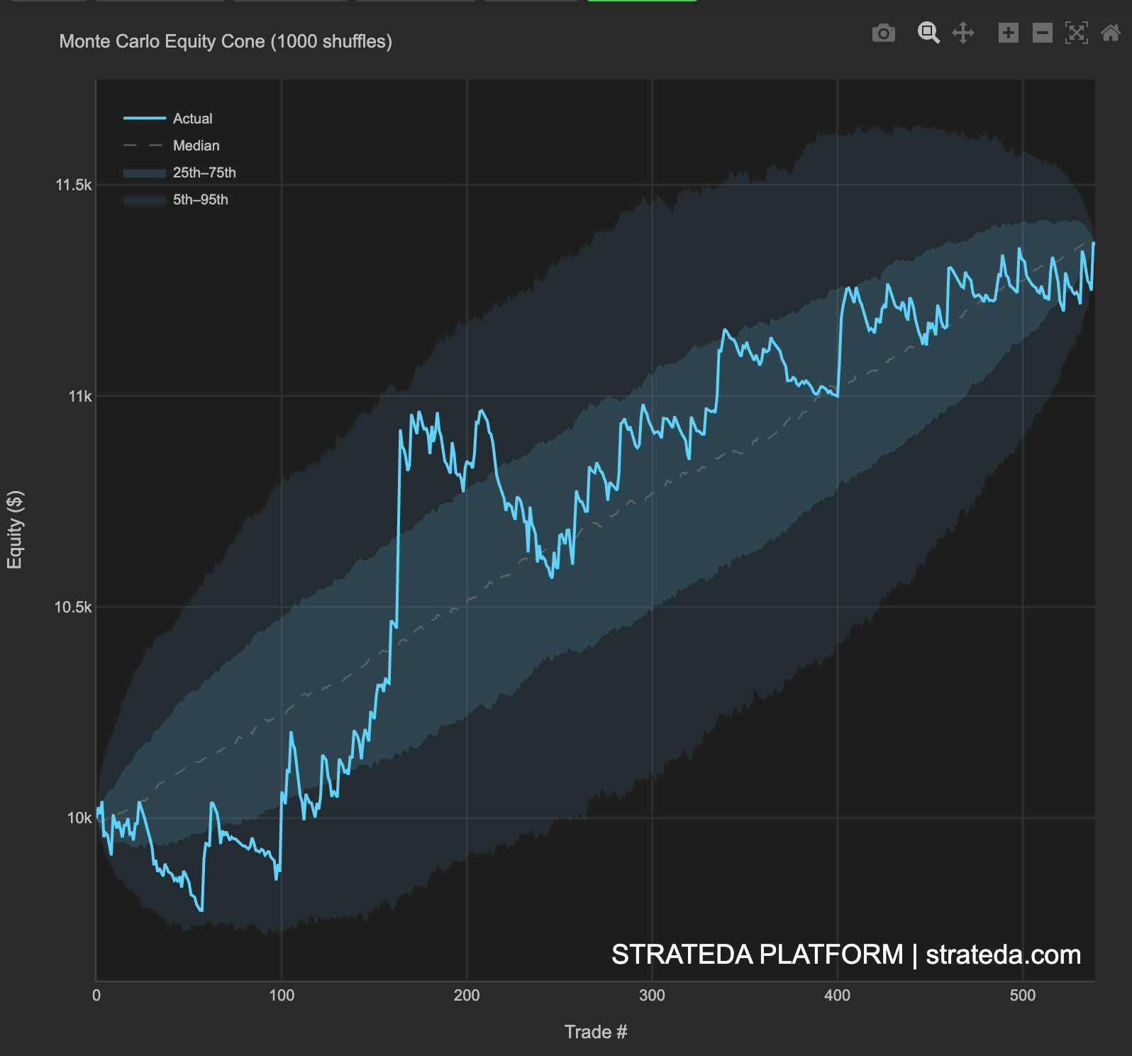
- Cyan line (Actual) — Your real backtest equity curve — the specific path your trades produced in their actual order.
- Dashed line (Median) — The median outcome across all 1000 simulations — the "typical" equity path if trades had occurred in random order.
- Inner band (25th–75th percentile) — The middle 50% of simulated outcomes. Half of all possible trade orderings produce equity paths within this band.
- Outer band (5th–95th percentile) — The middle 90% of simulated outcomes. This is your realistic range of possible experiences with the same trades.
- X-axis — Trade number (chronological sequence).
- Y-axis — Equity ($).
How to interpret it
Actual curve inside the cone
Normal. Your trade sequence produced results consistent with what random ordering would expect. The strategy edge comes from the trades themselves, not their specific order. This is the most common and healthy outcome — it means your backtest equity curve is representative of what you could expect going forward.
Actual curve hugging the top of the cone
Your specific trade sequence was unusually lucky. The edge is real — the trades are profitable — but the exact equity path benefited from favorable ordering. Large winning trades happened to cluster early, or losing trades happened to be spread out. Expect more variance going forward than your backtest equity curve suggests.
Actual curve outside the cone entirely
Either a very strong sequential edge (e.g., the strategy genuinely improves over time as it adapts to market conditions) or a data anomaly worth investigating. If the curve is above the cone, the specific trade ordering was exceptionally fortunate. If below, exceptionally unfortunate — though this is rare since the actual result is the one you observed.
Wide cone
High variance in outcomes depending on trade order. Your equity path is sensitive to sequencing — a few large trades dominate the result, and their placement in the sequence dramatically affects the path. Consider whether position sizing is appropriate, and check whether your strategy depends on a small number of outsized wins (cross-reference with the PF Sensitivity metric in the metrics table).
Narrow cone
Consistent outcomes regardless of trade order. The strategy edge is stable and not dependent on a few large winning runs occurring at the right time. This is the strongest signal of a robust strategy — the trades are individually profitable enough that their order doesn't matter much.
Using the cone for risk planning
The outer band (5th–95th percentile) provides your realistic range of equity paths:
- The bottom of the outer band at the final trade number represents your worst realistic case — the equity level you'd reach if the same trades happened in the unluckiest order.
- The top of the outer band represents your best realistic case.
- The width of the band at any point shows how much sequencing uncertainty exists at that stage of the strategy.
Use the bottom of the 5th percentile band as your capital planning baseline — if your account can survive the worst-case equity path, it can survive any ordering of these trades.
Example
Monte Carlo Equity Simulation for 200 trades on a DEMA/EMA crossover on EURCHF M30:
- Actual equity (cyan): Ends at $10,810 (+8.1% return). The path shows a smooth upward trend with one visible dip around trade 80–100.
- Median simulation (dashed): Ends at $10,790 — very close to the actual result, confirming the actual path is representative.
- Inner band (25th–75th): Final equity range 10,940. The middle 50% of outcomes fall within a ±1.5% range.
- Outer band (5th–95th): Final equity range 11,080. Even in the worst 5th percentile case, the strategy is profitable (+4.2%).
Interpretation: The actual equity curve sits near the center of the cone throughout — no evidence of sequencing luck. The narrow cone (±3.3% at the 5th–95th level) indicates that trade ordering has limited impact on the final result. The strategy's edge is distributed across many trades rather than concentrated in a few outliers. The worst realistic case still produces a positive return, which supports deployment with the current position sizing.